


PNC’s mantra of “boring banking” exemplifies the idea that banking is supposed to be boring. Your hard-earned money has no thrills, nor should it come with unexpected surprises. The same goes for your banking app. However, that doesn’t mean it can’t be more functional. The new PNC app features integrated branch-locating capabilities, a modernized look, and a live chat feature to streamline customer support.
UX Designer:
Tools Used:
While PNC’s existing mobile banking app meets basic needs and already offers push notifications, it feels outdated compared to industry-leading apps like Chase and Amex. Users can complete essential tasks, but the dated interface and limited support tools make the experience less seamless and modern than they expect.

This redesign presented a unique challenge: “boring” tasks aren’t typically engaging, yet we count on them being straightforward and hassle-free. After all, just as you wouldn’t want to click through a hundred buttons to turn on your car’s air conditioner, you wouldn’t want to navigate a maze within your banking app.


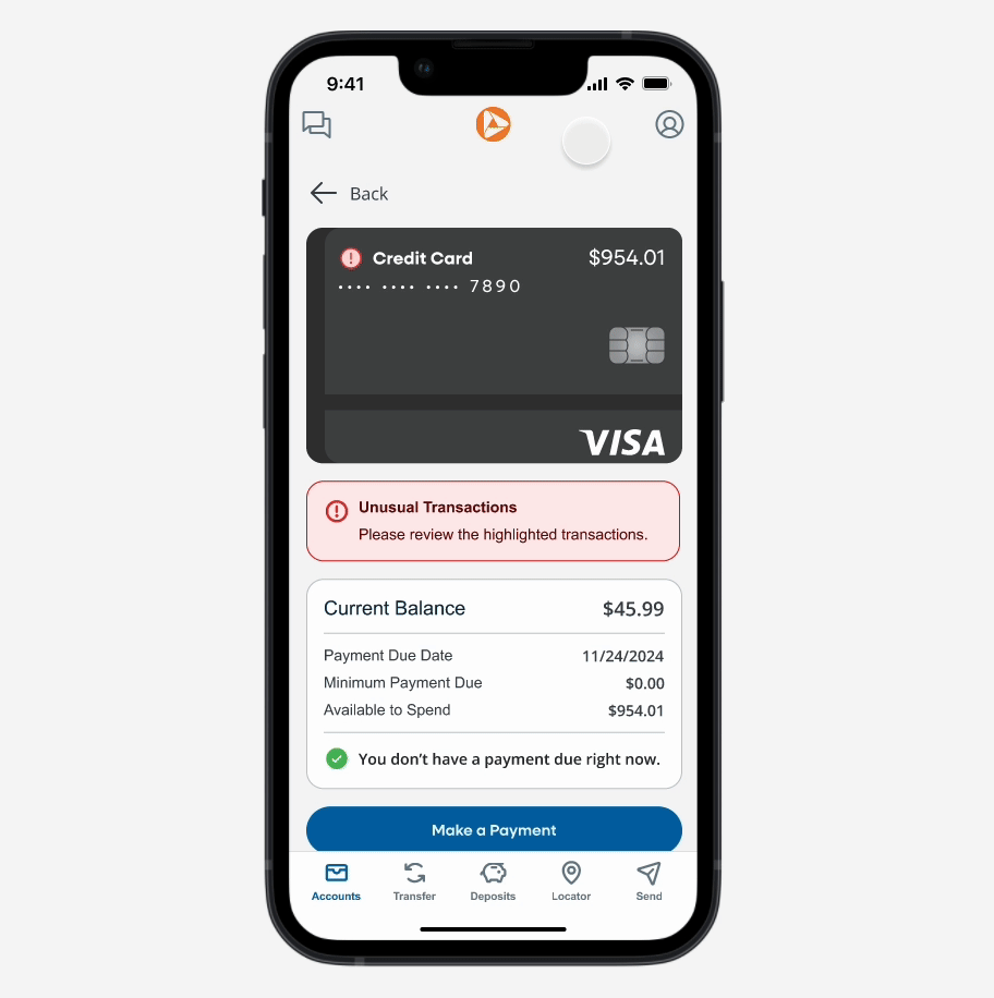
A streamlined user interface doesn’t have to be boring. This redesign brings a modern approach to a clunky, yet practical experience.
Simplified the menu structure to reduce clicks and surface frequently used features.
Added a live chat button across all screens, so users can quickly reach support without leaving the apps main workflow.
Removed the previous misleading, “ATM Access” button and added a locator to show users relevant options at a glance.

By eliminating clunky navigation, integrating real-time support, and refreshing the interface, the PNC mobile banking app now offers a streamlined experience that meets users’ evolving expectations. Customers can quickly view account balances, resolve issues through live chat, and find nearby branches in just a few taps—no unnecessary steps or tedious processes.
A streamlined user interface doesn’t have to be boring. This redesign brings a modern approach to a clunky, yet practical experience.
Simplified the menu structure to reduce clicks and surface frequently used features.
Added a live chat button across all screens, so users can quickly reach support without leaving the apps main workflow.
Removed the previous misleading, “ATM Access” button and added a locator to show users relevant options at a glance.

Throughout this project, I discovered the importance of striking a balance between aesthetics and usability. It would have been easy to create a visually striking redesign that, ultimately, didn’t address user needs. Instead, I focused on ensuring every design choice—whether it was a layout tweak or a new feature—enhanced the app’s overall functionality. By putting function first, the user experience became smoother, faster, and more satisfying, proving that “boring” can indeed feel modern when it’s done right.

PNC’s mantra of “boring banking” exemplifies the idea that banking is supposed to be boring. Your hard-earned money has no thrills, nor should it come with unexpected surprises. The same goes for your banking app. However, that doesn’t mean it can’t be more functional. The new PNC app features integrated branch-locating capabilities, a modernized look, and a live chat feature to streamline customer support.
While PNC’s existing mobile banking app meets basic needs and already offers push notifications, it feels outdated compared to industry-leading apps like Chase and Amex. Users can complete essential tasks, but the dated interface and limited support tools make the experience less seamless and modern than they expect.


